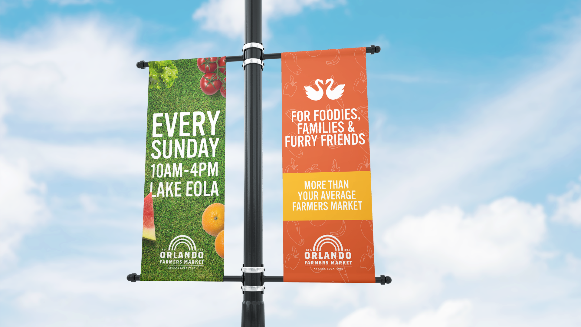
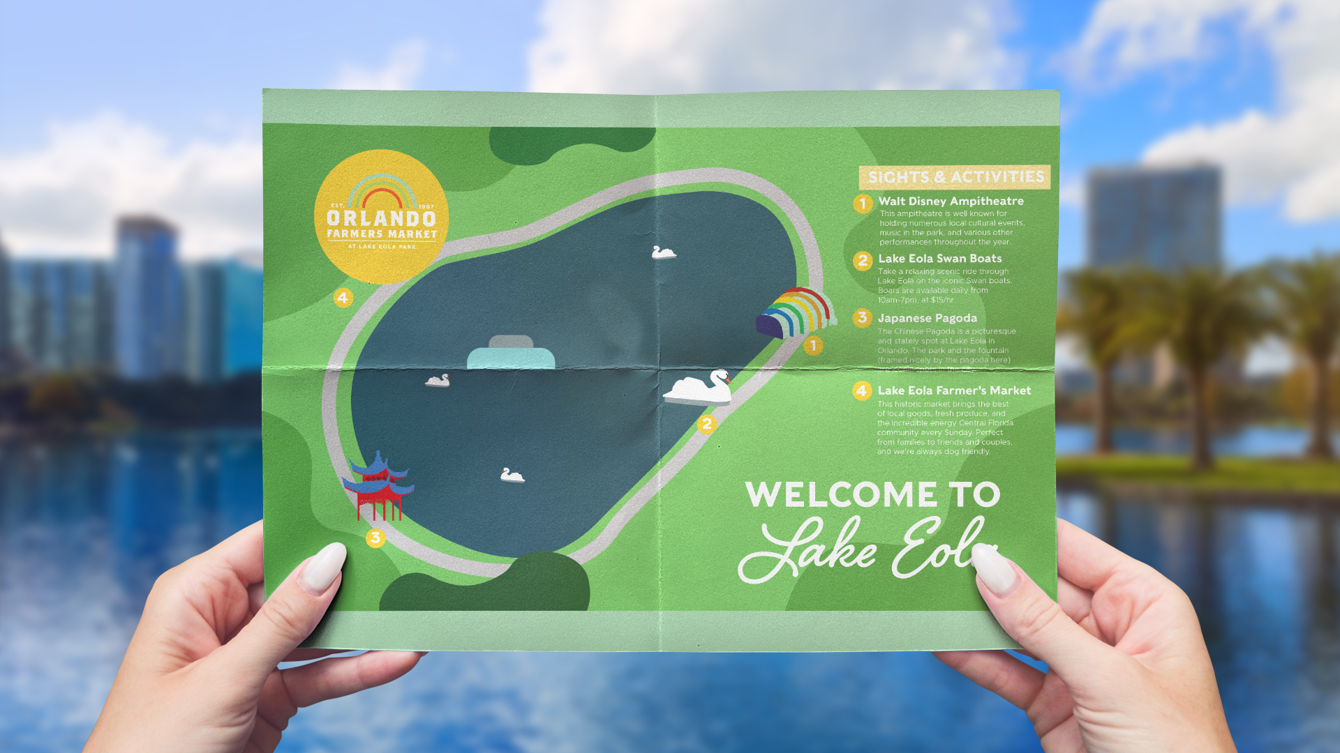
My rebrand for the Orlando Farmers Market was created out of the love I have for my city and how it continues to evolve and grow past just being known for the theme parks. For this rebrand, I wanted to freshen up the whole look of the market. To me, it is not just about the goods available but mainly about the community aspect. Orlando is fun and diverse and I wanted to express that through bright, warm colors and textures. I added a more modern touch for the rebranded logo but kept its history in mind. It not only represents a well known Orlando landmark, but also community and diversity.
